Briefing:
Excellence is in our fabric
Previously working under the name Mindwork Media, the guys at Weave felt it no longer represented the services they want to focus on. The company is developing new data driven solutions and is moving to a more service centered position. This off course, called for a rebrand! Weave would be the new name of this agency, representing a way of working that focusses itself on delivering a perfect mix of concept and execution from start to finish.
Process
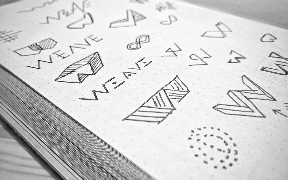
The beauty of creating a brand is in the process. Every project starts with the research and concepting phase. During this phase i explore ideas through both brainstorming and sketching. For this project the concept was in the name "Weave". I wanted to create a logo that was intersecting, connecting and minimal. The W is a lovely symmetrical shape, which quickly made me decide to pursue and explore it further.
Concept
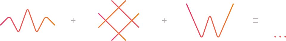
Eventually the concept brought me to the idea of mixing the essentials of the brand and using them as ingredients for the logo. I used a "sine wave", which is very representative of the data analytical aspect of the companies services. Which i mixed with an intersecting/intertwining pattern which is essentially "woven" to create a spacious object which due to its depth and portrayal from the right angle looks like an uppercase W. The "W" off course, also represents the first letter of the name, and due to it's strong shape will scale great on various media.
Logo Design
Brand Info
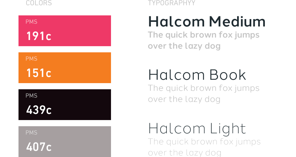
Although Weave's wordmark is a custom solution, the stationary also needed a modern font with technical features.
When we discovered Halcom we knew right away, this was gonna be our perfect font. It's open, geometric forms are friendly, very readable, and timelessly modern.
Stationery
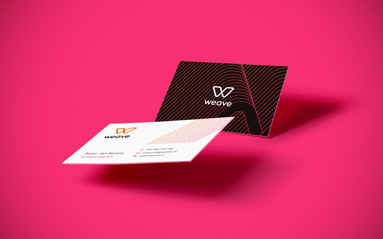
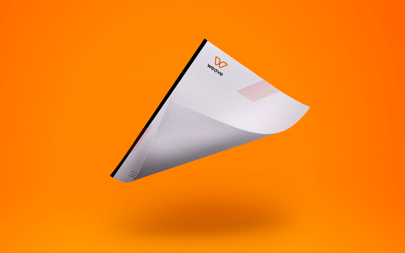
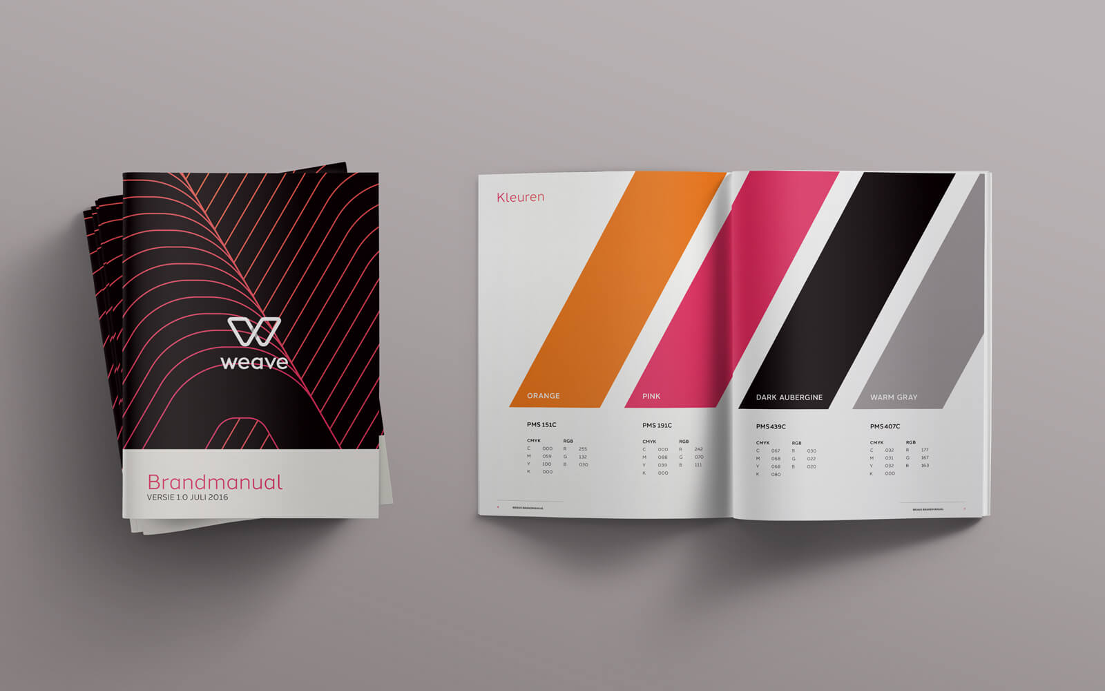
The stationary is bold and colorful, but doesn't lose its serious tone of voice because of the precision cut details. Subtle and strong, confident in it's presentation. The brandmanual was quite extensive, covering several items from use of color to text markup, use of angles and best practices for the design elements.
Posters
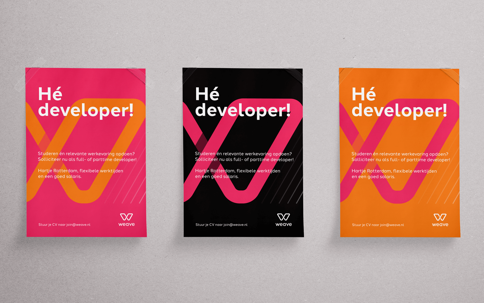
To attract new developers to their team i designed a bold and colorful poster which is both minimal and diverse.