Briefing:
We are all connected
Jambo Media is an internet marketing agency in the Netherlands. Their expertise in SEO, SEA and online advertising makes them a great strategic partner to work with. We’ve done a lot of projects together over the years and they approached me to take their branding to the next level. A big refresh was needed and till this day it’s one of my favourite cases.
Concept
The web is, essentially, a lot of connected computers. But it's more than that. It's people with dreams, it's people sharing stories, it's people selling products, and it is so much more.
It's also serious business.
The concept of this logo was to envision those small connections and display them as facets in a globe.
The globe represents the "internet" as we've grown so accustomed to. Every angle on the globe is someone making connections. Jambo Media takes these "connections" and makes them work for your company. Either by improving your website, growing your audience, or upgrading your conversion.
Brand Assets

The friendly and attentive service that Jambo offers is embodied by a warm, welcoming and fresh orange color choice. The red and yellow hues create depth and make the logo look like a big gemstone. The brand instantly pops out and thanks to it's modern and futuristic typography, set in Akko Std, it's very recognisable. Akko offers a wide array of styles but we're working primarily with the light and medium variants, these give a good contrast which works just great.
Versatile Logo
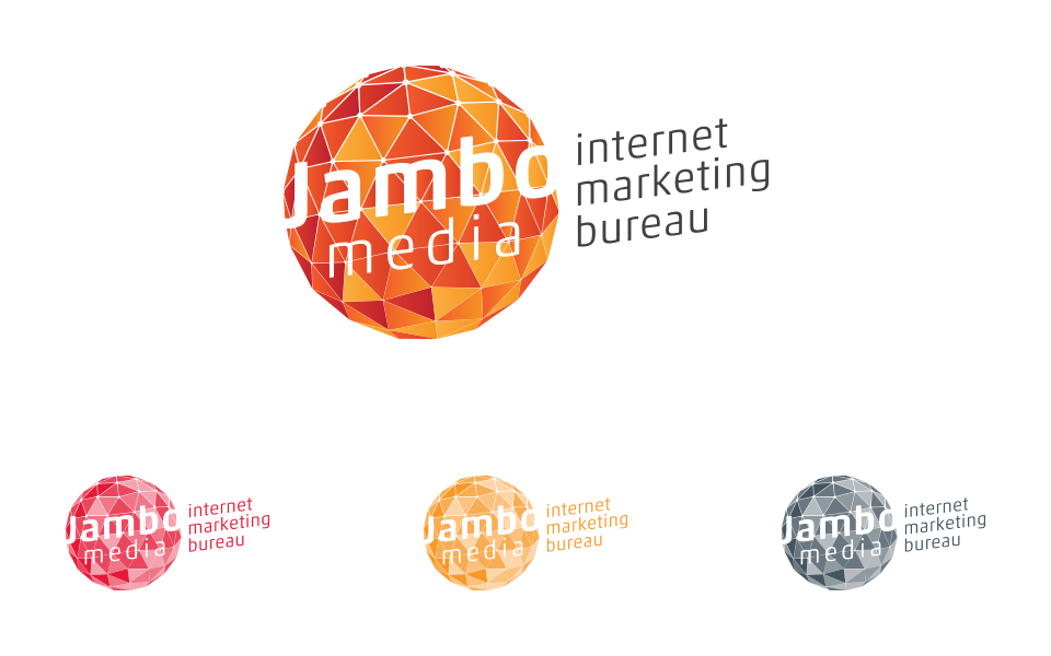
Even though the logo is built up from various gradients, it also has to work if we're restricted to use just one color.
I made a construction of separations in opacity to fix this problem. And as you can see it still works great.
We decided we'll also use this version for darker backgrounds, where the logo will always be used in shades of white.
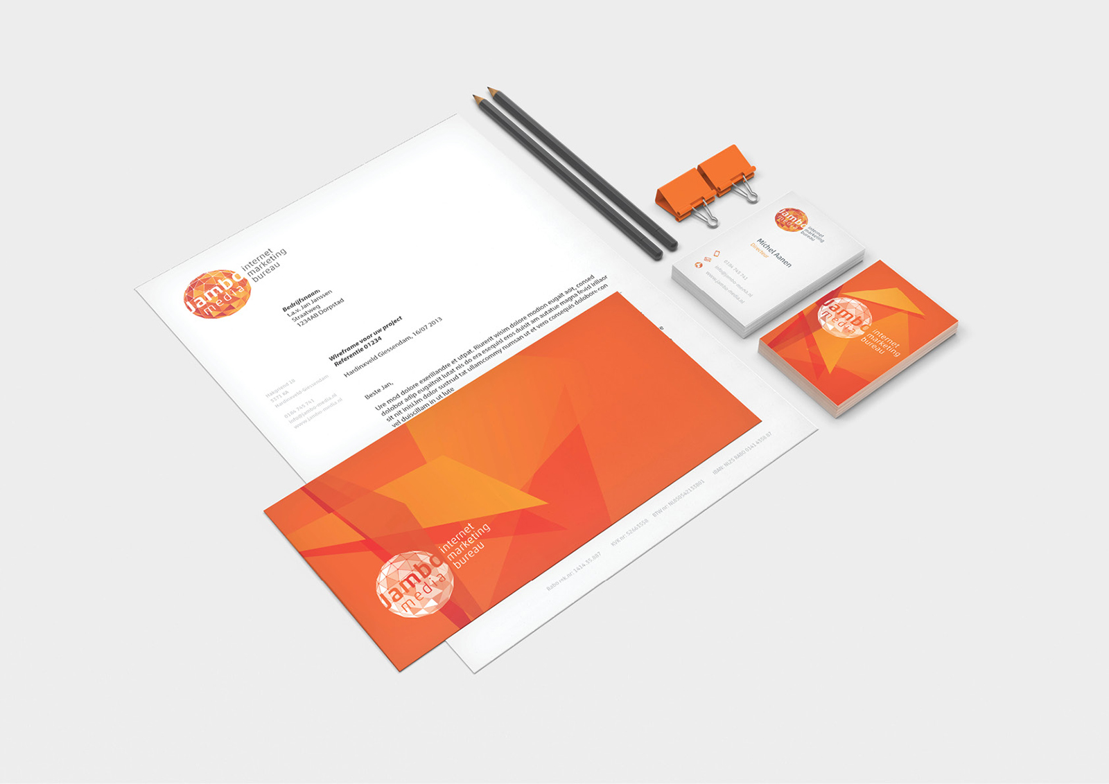
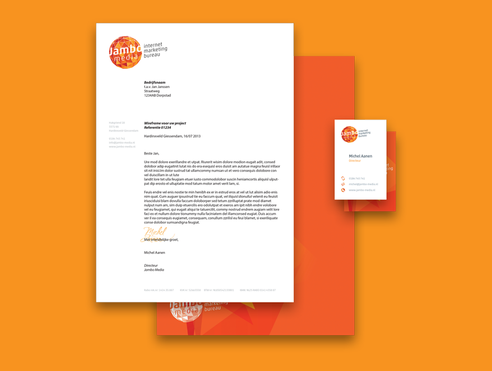
Stationery
Icons
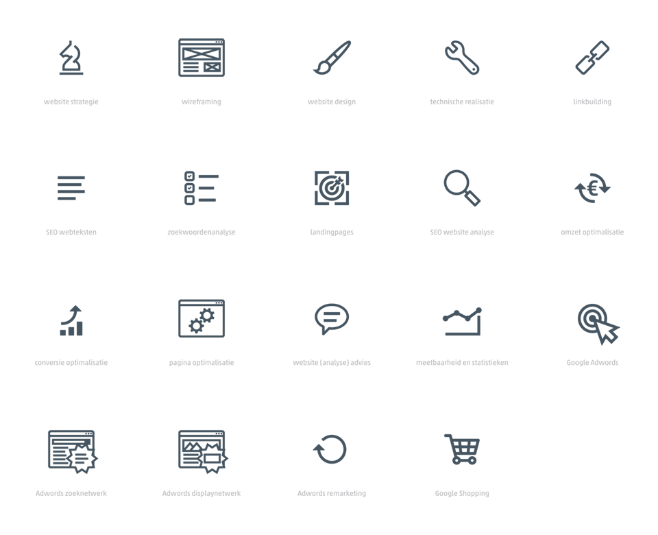
Every project benefits from some unique icons to highlight services. For Jambo Media i designed some "big" illustrated icons, and a set of smaller ones which are used throughout the branding system, but also for internal use and presentations.
Iconset