Briefing:
Refined taste
As one of Rotterdams’ most exciting experimental restaurants, Zino Urban Bistro offers a unique concept. The “Chefs’ choice” menu lets you pick between 2 or 3 diverse menu’s one vegetarian, one with meat or fish. Whatever you’ll choose, it’s always something exciting and unique. Chef Martijn is a marvel in the kitchen and is always looking for ways to create a beautiful dish.
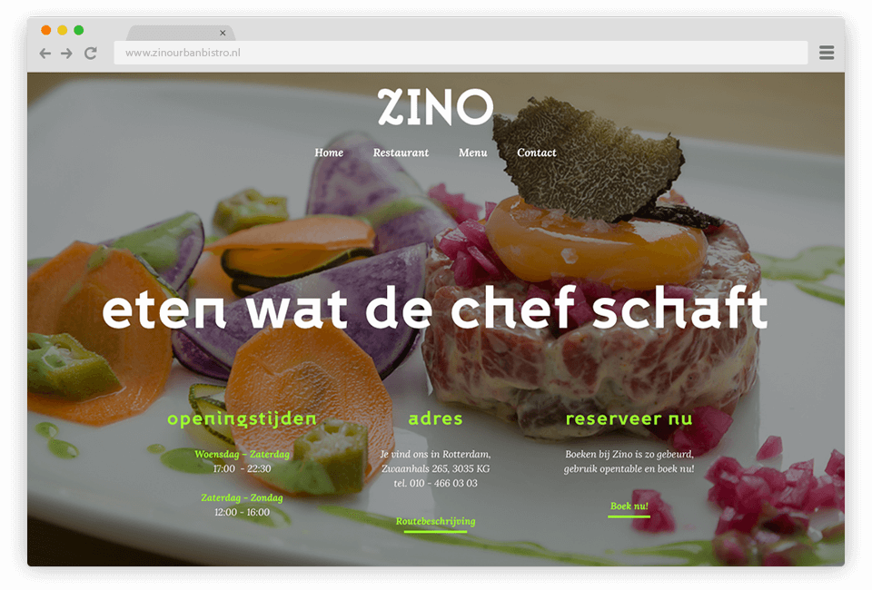
Zino was looking for a way to structure their menu, and refresh the brands’ identity. Due to the experimental nature of the chef the menu changes very often, therefore it was important to offer a template design which would always work for the textual input. We chose to go with a deep blue with a purple hue for a very eclectic look. Accompanied by simple but fun illustrated icons we quickly communicate the subject matter.The end result is a playful, modern and exciting visual language which is both simple and distinguishable, fitting perfectly with the Zino Urban Bistro brand.
Branding

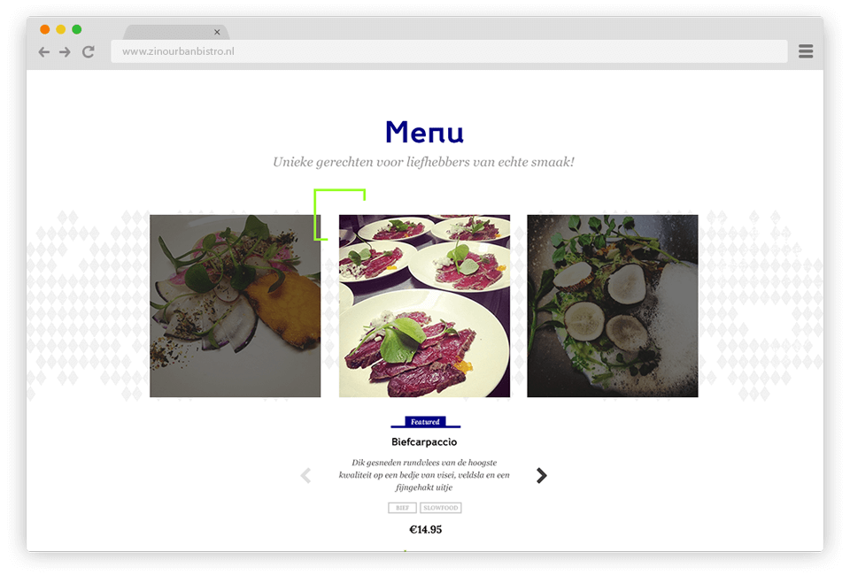
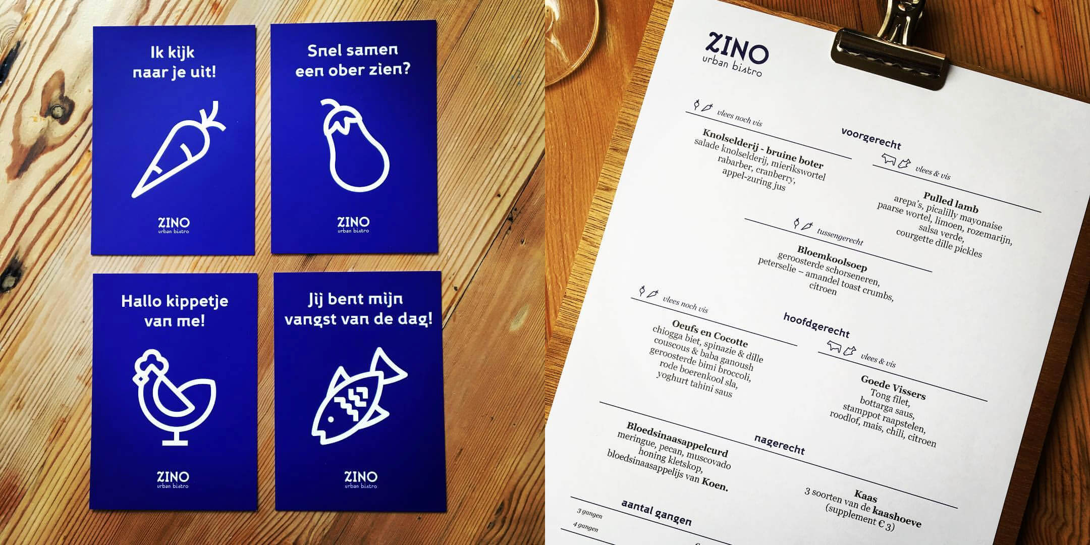
Because Zino's menu changes a lot, we chose to create a sort of template which can be changed over night. The menu works with 2 "sides", the left side is the vegetarian side, the right side is the meat/fish side. People can pick one side for each course. The icons subtly explain the concept as well.
Postcards
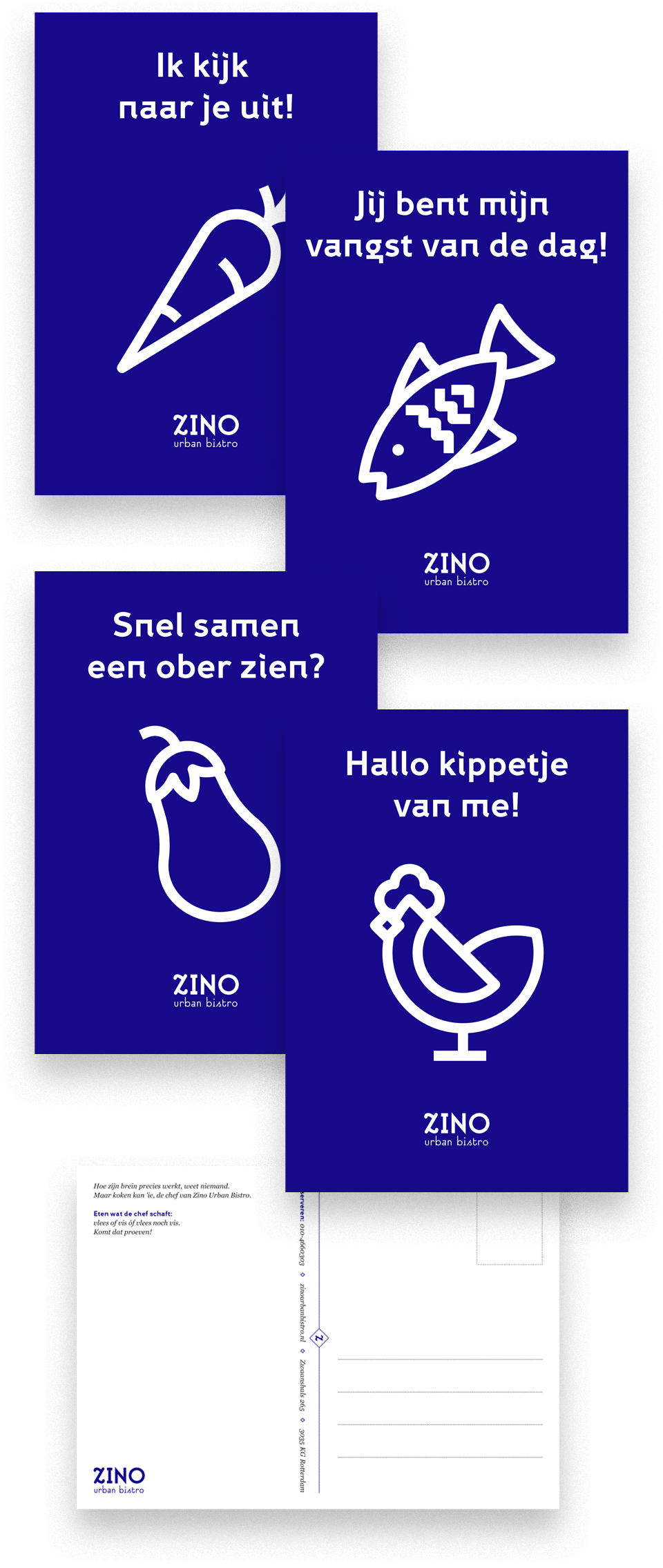
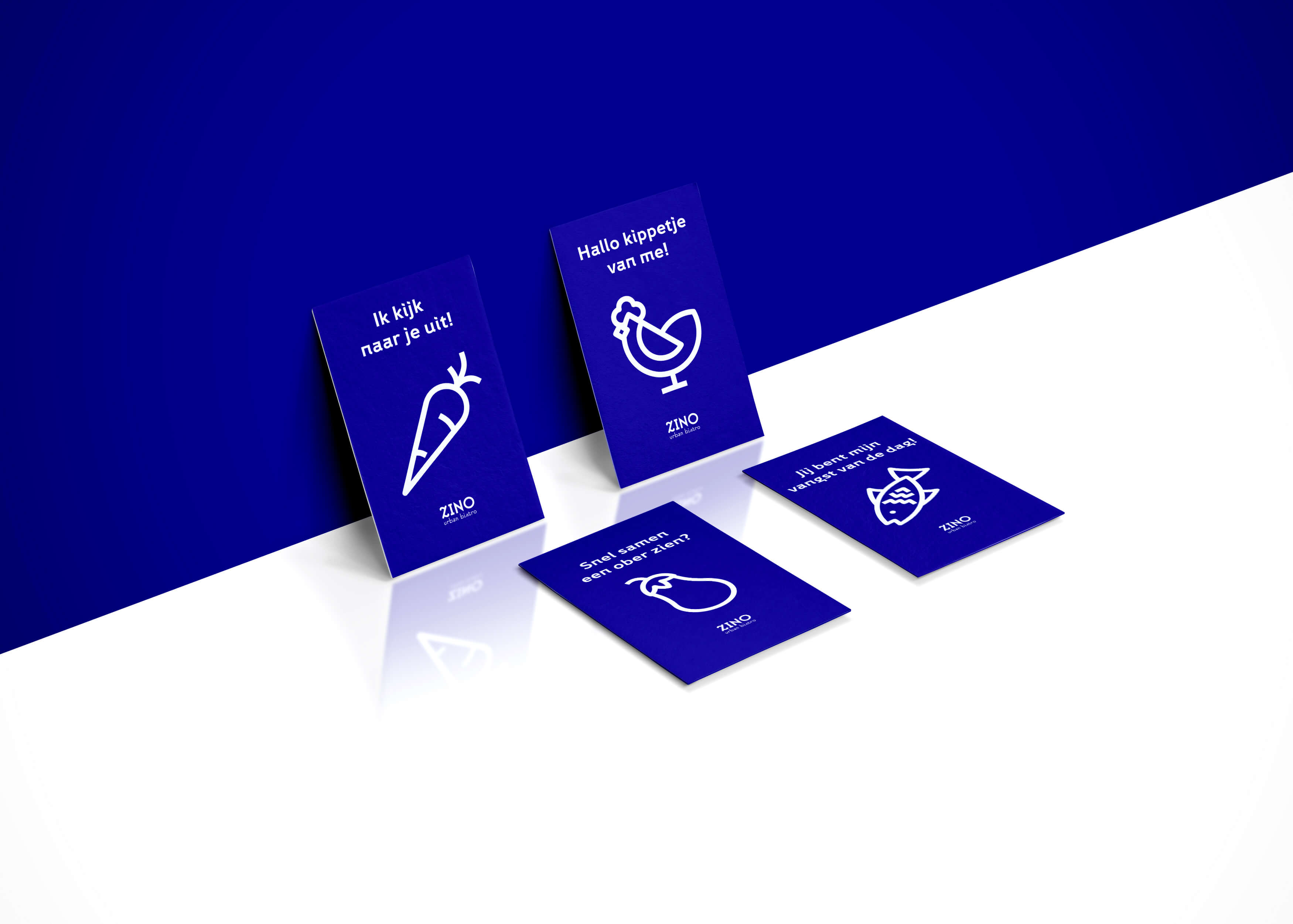
For customers that visit Zino we made a small series of postcards based on the icons of the branding accompanied by a clever text. The concept sprouted from the idea of having fun with the icons. When i suggested playing with the ? emoji to playfully "seduce" people to come to the restaurant, the idea for these postcards was born.
Loosely translated:
1) Ik kijk naar je uit = Looking forward to see you
2) Jij bent mijn vangst van de dag = You're my catch of the day
3) Snel samen een ober zien = I wanna show you this eggplant
4) Hallo kippetje van me = You're my chick!
Website

